Ableton’s premier DAW (Digital Audio Workstation) gains a ton of new features and some welcome interface tweaks.
Ableton Live 12’s new features and improvements add up to a substantial upgrade–well worth a whole new number (up from 11). Included are numerous interface enhancements, a couple new instruments and effects, as well as a plethora of new MIDI editing and generative tools.
If there’s any downside at all, it’s that the new features contribute to the program’s ongoing tussle to maintain its minimalist, non-conformist charm. (Hint: It hasn’t lost it yet.)
What is Ableton Live 12?
Ableton Live is a Digital Audio Workstation (audio and MIDI recorder/editor) that’s been around for well over two decades now. The original mission was to create a DAW that allowed users to create, edit, arrange, and play content on stage, on the fly. Aptly named, for sure.
Over time Live has grown into a full-fledged, pro studio-capable program with legions of fans, and numerous usage scenarios. I use it for recording and editing MIDI/audio. But sound creation and composition employing the numerous virtual instruments, effects, and sequencing tools accounts for a major portion of its usage. As does the aforementioned moniker-described mission–live performance.
New features
What’s new in Live 12? Plenty. For starters, there’s a master key signature that affects a lot of the synths and editing features in Live.

Note that the per-clip key signatures from Live 11 are gone, with everything working off the global signature.
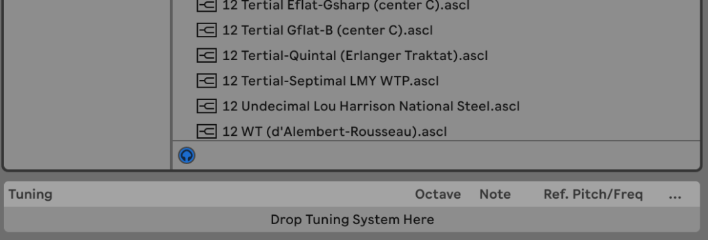
Then there are universal micro-tunings which also affect synths. Micro-tunings are deviations from the western tempered pitches. They can be very handy for mimicking music of non-western cultures as well as producing dramatic soundscapes.
Formerly, micro-tunings were available only in the Max for Live programming interface that ships with the pricier versions of the program.
There’s a new instrument called Meld which is bi-timbral and MPE-capable (MIDI Polyphonic Expression).

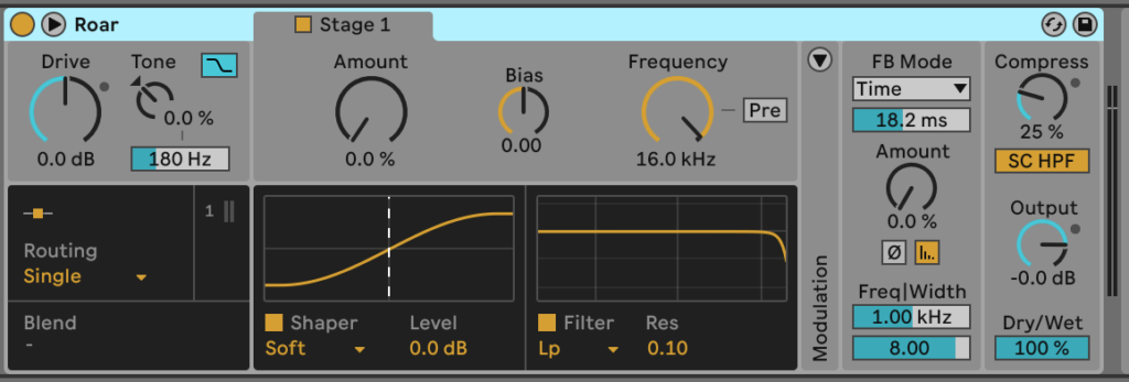
The latest version of Granulator (III) is now also MPE-enabled. A three-stage saturation plugin called Roar has been added, and there are two new packs: Lost and Found (unusual sounds), and the Performance Pack which is aimed at the needs of live performers.
If you weren’t familiar, packs are libraries of sounds, effects, or tools that you can add to Live. Which packs are available to you depends on the version of Live you own.
Which brings me to some daunting news–Live isn’t particularly cheap: the 16-track Intro with 5GB of sounds and a limited feature set is $80, Standard with 10GB of sounds and most features is $351, while Suite with 75GB of sounds and all the features is a cool $600.
You can check out the comparison chart, but unless your needs are meager indeed, you’ll need Standard at the very least. I was present for the evolution from 4-track to 8-track to 16-track to 24-track tape machines–and every jump made a world of difference in the ease of production.
More importantly to the purchasing decision in my case, however, is that the Ableton Sampler is only available in suite. Intro and Standard only feature Simpler which doesn’t support velocity layers, i.e., multiple samples of which one is played according to the level of velocity employed. This vastly complicates the process of creating realistic orchestral instruments, drums, etc. If you have a third-party sample player such as native Instruments’ Kontakt, this won’t affect you.
Users that employ the piano roll to enter and create music, especially those coming from FL Studio, will be happy with the new MIDI tools. You can finally split notes; there’s a velocity ramp function below the grid; as well as a host of modifiers in the clip header such as humanize, legato, stretch, add interval, set length, and even arpeggiate. You can also fold to the aforementioned global scale.

Above is the Live MIDI editor, FL Studio users were clamoring for, while below is the one I use with the training wheels hidden. In truth, I find scale highlighting on the piano representation somewhat of a visual muddle. Being equally truthful, I find the fold and some of the modulation and generative functions useful. Thanks FL Studio users!

My real wish is to be able to apply grooves (MIDI timing and velocity templates) to only notes I’ve selected, rather than entire clips. For instance, groove only the cymbals or kick, etc.
Grooves always produce results more in line with what I want than the humanize or random functions. Especially as I can create my own grooves from previous edits. It takes more work of course than pushing a single button, but…
A great many of the other improvements involve the interface as well…
Evolving Interface
I’ve heard Live’s GUI (Graphical User Interface) referred to as everything from butt-ugly and dated, to marvelous and futuristic. The look and approach are unique to be sure, and honestly — I quite like them.
Ableton has actually changed the look of the main page (marginally), and I must admit it’s more to my liking — at least before I start opening other panes. Gone are the large triangles for opening and closing panes, replaced by gentler affairs with drop down options. There are also a couple new, and very attractive themes. Note that themes in Live are all about color, not shapes.
How stage performers and DJ’s will like the new look I can’t say, but the new icons look less clunky and I suspect most people using Live on stage rely more on keyboard shortcuts than the mouse. More on those in a bit.
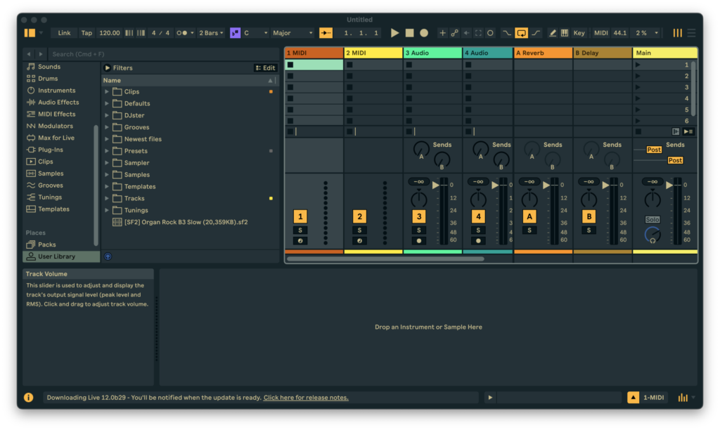
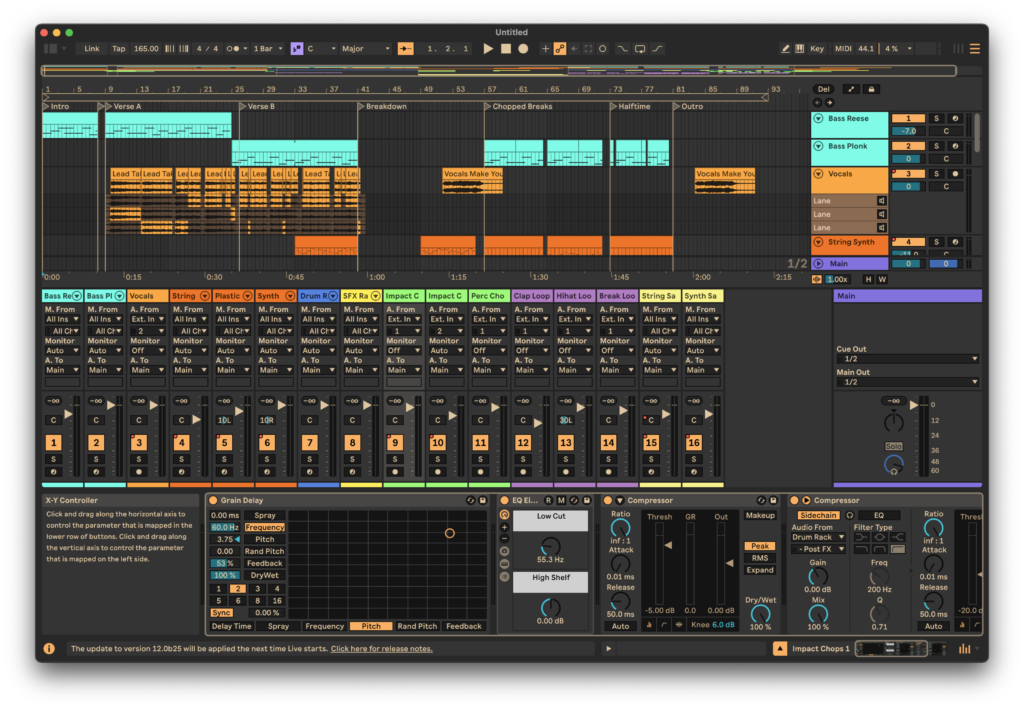
Additionally, the mixer, formerly visible only in clip-launching session mode can now be displayed on the arrangement page. Indeed, you can stack the editor, track detail, and mixer panes (given enough space) below the arrangement timeline.
Formerly, you could only show one, and toggle between them. There’s still a toggle for that if you want to optimize arrangement timeline space but the mixer sits on top of them. Now if there were only a three way toggle that included the mixer, I’d be a happy camper–I much prefer only one visible at a time.
One thing I asked for long ago is now reality — the settings dialog finally scales with the rest of the program. It used to remain at 100%, even if you set everything else to 140% or 80% zoom. BTW, interface scaling is one of the original reasons I started using the program. Larger for older eyes.
I’ve already discussed many of the new MIDI/piano roll functions. I’d have been happier if they’d all been relegated to the clip header at the left, as now the piano roll is taller than the track detail. When you flip between the two, it’s a bit jarring visually. That said, I can basically hide all the stuff I don’t need, so the mismatch is my sole and exceedingly picayune complaint.
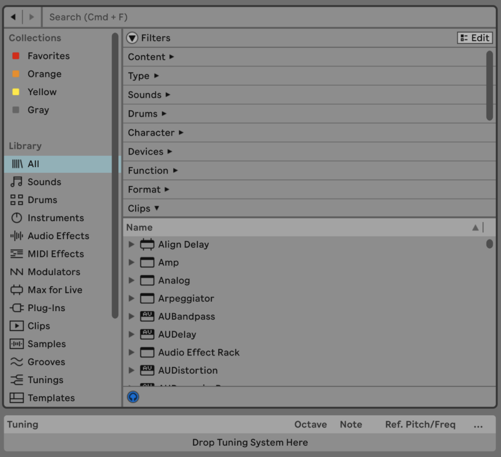
The other big recipient of interface tweaks is the sound/sample/plug-in/etc. browser (see below) which now has filters, tagging, and browser-style back/forward controls so you can step through your searches, etc. I don’t have nearly enough stuff to care much about this, but if you have thousands of samples and clips, these features will undoubtedly prove handy. There’s even some smarts now available in that Live will try to match up sounds from their audio qualities via sound similarity search.
One area, where I think Ableton misses the mark is with their keyboard shortcuts. Not that they’re particularly hard or illogical. But there’s a lot of them, including some new ones, and they’re almost all hardwired, i.e, not user definable. Also, some have changed for Live 12, some have been removed or given over to new functions. Let chaos reign! (Kidding)
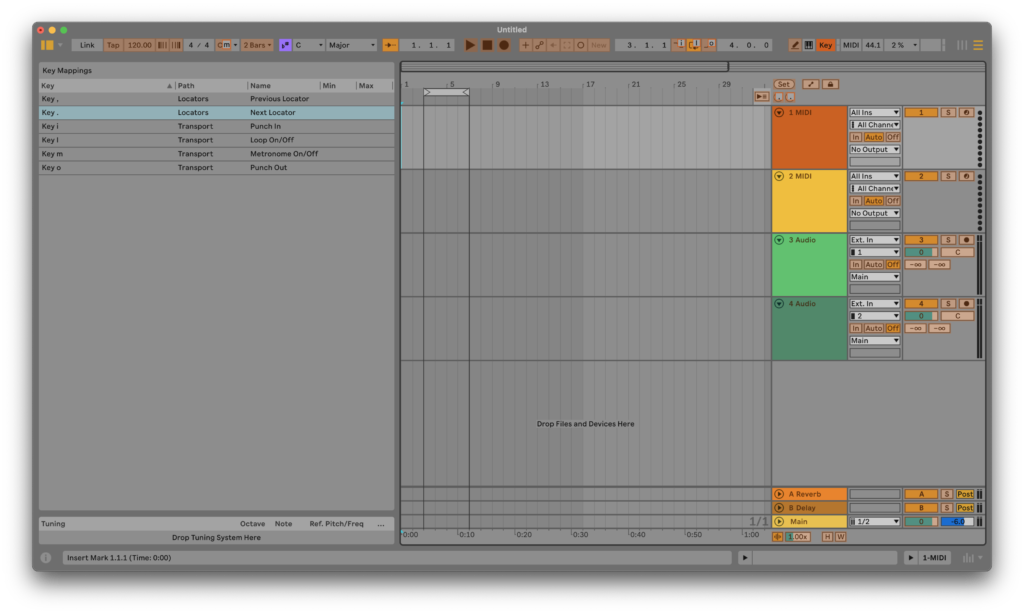
Live is used in several different ways, so it might behoove the company to let users define/redefine their own. Teasingly, there’s already an Key Assign mode and a listing (see above), it’s just not close to comprehensive.
If you work with a guitar in your lap as I often do, the ability to reassign multi-key shortcuts to single-key shortcuts is almost essential. Live reserves many of these one-key commands for functions I don’t need or use. Grrr…
As of now, I use third-party software such as AutoHotKey (Windows), and Keyboard Maestro (macOS) to define my own key commands. Not that these aren’t fine programs, but it would be far more elegant (and cheaper) if Live let you define your own.
Fighting the blivet and mundanity
If you’ve never heard of a blivet, the polite definition is ten pounds of “stuff” in a five-pound bag. Insert your own word for “stuff”. This is also known as feature bloat and interface saturation in the software/GUI realm.
A large part of my attraction to Live has always been its relative visual simplicity — I find it relaxing compared to many other DAWs. The more features that are added, the less minimalist the program becomes — an issue in all modern DAWs and productivity software. Given that, it’s remarkable that Live isn’t far more cluttered than it is.
My other minor gripe is that with each iteration, Live drifts a bit more towards the mainstream. If not visually, then in the way that Ableton crafts methodologies. It’s still clever in some ways, but not deviously clever as it often used to be.
Recent feature adds, such as comping, lack imagination. I.e., they’re just like everyone else’s. There was actually a rather unique way to switch between takes within the clip detail editor a couple of versions back that could easily have been expanded upon. Instead it was removed and we got the ubiquitous, real estate-hungry, old-school take lanes. Boring. Did all the imagineers go on vacation or is this about broadening appeal? Your call.
I also classify the piano roll as increasingly mundane. It’s slowly drifted from a tool that was facile once you caught on, to one that borrows from the competition. If I’m being completely honest, I’d call it dumbed down, though it does retain its former unique facility to a large degree.
Lest you mistake this mini-rant for a no-buy recommendation… Budding blivet or no; not quite as clever as it used to be; I still find Ableton Live easily the best thing going in DAWs. Opinions, of course, will vary.
Please Ableton!
This being my personal site, I’m going to list all my personal feature requests, including those already discussed. Being a former programmer, I figure it would take exactly one person a day or two to implement them all, though it would also require extending the project and options file formats. Then again, you should always double programmer estimates! 🙂
— Completely user-definable keyboard shortcuts, with all commands available including the ability to toggle the track monitoring state (On/Auto/Off).
— Allow grooves to be applied to selected notes as well as entire clips.
— An “Open last project at start” option so we can pick up right where we left off.
— Save the state of the Punch In, Punch Out, Follow, and Metronome with projects. The first two bite me all the time when I load a project. I almost always have them selected, and loading a new project deselects them.
— A keyboard shortcut to toggle the current track input monitoring state. You can map a shortcut to a specific track, but you have to remap every time you switch to another track for recording.
— Remember the last used audio interface when it’s disconnected, and try it again before forcing the user to re-select it manually.
— Remember the zoom and cursor location of individual clips in their editing window. As of now, every time you switch clips you’re back to the default zoom level and cursor location.
— The ability to cycle through the clip detail, track detail, and mixer panes rather than just open, close, and stack them.
Is Live 12 worth the upgrade?
Upgrading is of course a personal choice. Me? There are enough improvements that make my life easier, and those that I don’t need can be hidden (largely), so I’m all in on 12. That said… How about those user-defined keyboard shortcuts and time-saving conveniences?