While Live 11 is a welcome update that will make most users very happy. A partial review, partial design critique.
The latest version of Ableton’s venerable DAW fulfills several long-standing, and popular feature requests: Traditional comping with lanes, MPE support, limiting the MIDI editor to a scale, internal tempo following outside input, randomness, probability and a slew of FX and instrument improvements.
If you’ve been waiting for one of these features–you’re going to like Live 11. I like it, though if I’m being perfectly honest, I think the developers might have done a bit better on some features interface-wise. Some lack the ingenious streamlining that’s one of Live’s most beguiling qualities.
Disclaimer: I don’t use Live for live performance, it’s original raison d’être. Much of Ableton’s design philosophy caters to that mission. I use it for recording myself, editing and mixing, so read this with that in mind.
Note that as of the Ableton Live 11.1 Beta the issue of room for MIDI editing in the piano roll is completely gone. The tabs are now vertically oriented, collapsible and may be hidden entirely by double-clicking on the clip header. Sweet! There’s also now an Apple M1 native (universal binary) version.
Nits and bolts
If you’re not familiar… MPE is MIDI Polyphonic Expression, where the pitch of each note you play on a keyboard can be varied via movement, and the timbre via pressure. In other words, each of your ten fingers, like ten tiny violinists, can control the pitch and shading of their individual notes. Read about Roli Seaboard for more on the possibilities.
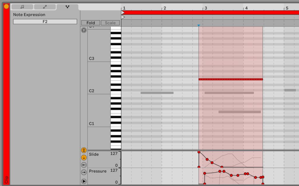
Live 11’s brand new MPE implementation aligns nicely with Ableton’s previous MIDI editing methodologies. Select a note and you can edit its pitch (slide) and pressure (timbre, etc.) in lanes beneath the main MIDI editor window. No gripes here. It’s a very, very nice add for those that need it.

Also quite nice is that the multi-clip editing now allows you to edit notes from all the selected clips at the same time, rather than just the notes from one clip. In other words, what was formerly just multi-clip viewing, is now truly multi-clip editing.
What I’m not particularly enamored of, is the way Ableton laid out the new MIDI editor options pane. The new features seem tacked on in a way that’s not particularly consistent with the existing interface, and there’s significantly less room to view and edit notes.
Below are screen captures of the new MIDI editor in 11, the 11 MIDI editor with the first pane collapsed (the others do not), and after that the MIDI editor in 10. You tell me.


The simple solution would be to let you collapse the headers fully, but for some reason Ableton has chosen not to do this. I’d love to know why.
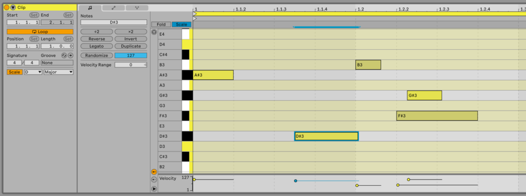
Additionally, I find the new limit-the-piano-roll-to-a-scale function, while possibly handy (some users apparently can’t live without it), a hot visual mess. I’ve always found the piano a somewhat poor representation that doesn’t delineate the black and white keys properly. I don’t care about skeuomorphism, but if you’re representing something real, you could come up with something a little closer.
With scale limiting applied, the piano image is now actively distractive overkill, distorted by colored markers. When folded and missing so many keys, it’s nearly useless as a visual clue. (It is used to select notes, and play them so it needs to be there)

Note that the image above shows a scale applied to a clip which already had notes outside of that scale, hence the gray lanes for the out-of-scale notes. Nice touch that. Still, I’d opt for simply coloring the lanes and leave the piano keys alone. Less is more.
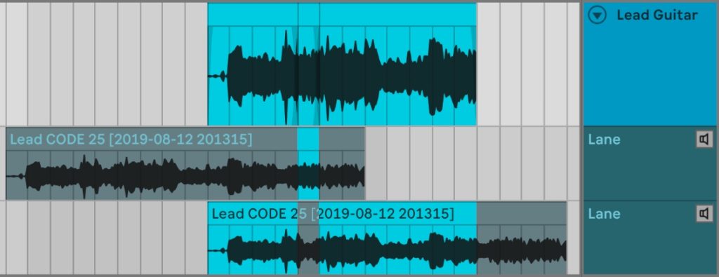
Where I think Ableton really had a chance to shine, but took a rather dull way out, was with comping. Comping is hacking together a “perfect performance” using the best bits from several takes, aka performances of the same material.
Throughout the rest of the DAW community, and now Live, this is done by representing the individual takes as sub-tracks, aka lanes. You swipe the portions you want from each take lane and they’re added to the final playback/parent comp. See below.

This method is efficient, but you can wind up with a whole lot of take lanes, eating up a whole lot of screen real estate in a hurry. It’s also unnecessarily complex visually for what’s basically an aural operation (listening and deciding). Nicely, you can link tracks to comp multiple vocal or drum mics, etc.
A far better implementation (IMHO, of course) would’ve been encapsulating and automating the existing inline method described in the excellent Beat Academy video found here.

You can get an idea of the basic concept in the animated GIF shown above (it’s a bit slow to load). Basically you split the clip by phrase and then change takes for each phrase using the keyboard or mouse. I’ve also described the current kludge step-by-step (with some refinements to Ill Factor’s method) in this article.
The older method is very quick once you’re used to it, but requires more steps, and can only be used on one track at a time. Ableton could easily have put a nice pain-free wrapper on it and added tweaks such as the ability to import takes, link tracks, etc.
I’m quite sure there would have been initial complaints about this method–old habits die hard. But I’m betting users would take to it like a duck to water once they actually sat down and used it. Maybe the inline method could be implemented as a hipper alternative.
On the other hand, Live did extend the take feature to MIDI editing, which I find very cool.
More new features
Tempo following, or Live adjusting its playback speed to match that of an external device or input is the other major technical add. That opens up a host of possibilities for combining Live playback with live performers.
Spectral display has been added to several modules; there are new instruments;, and racks may now have 16 macro controls rather than the former 8. Alas, there are still only 6 return chains for sub-mixing complex instrument or drum racks.

Probability has been added to MIDI clips. I.e., you can set the likelihood that a particular note will or will not be played, and at a randomized velocity. For the pushbutton music-making crowd, this means a lot more variation to their music without actually having to create it themselves. You can read more about these new features at the Ableton site.
Bloat alert (pale yellow, not red)
I’ve tried every DAW on the market at one time or another. I stick with Live because it’s extremely quick procedurally once you know it; the interface is scalable; and it’s far cleaner visually than the other major DAWs. Alas, it’s slowly accumulating eye detritus.
Live 10 added quite a bit of visual clutter to the arrangement area in the form of lines and contextually sized track headers. Perhaps these help with live performance, which is not something I do, so I’ve never really complained. But when the track count increases, they make for a rather awkward picture.
As for Live 11, I’ve already discussed the MIDI editor’s reduced editing space, and distracting piano representation when scale-limited. However, the context menus are also becoming a tad less wieldy and tiny icons are multiplying as well.
Live is still the cleanest DAW out there, but it may not be for long if the current trend continues. An easy cure would be to increase the customization options, allowing users to hide more of the stuff they don’t need.
You’re still the one
If you’re not familiar with Live, I highly recommend perusing the users guide and/or taking it for a spin. It’s pricey, but for live performance or creatives recording on their own, I consider it easily best of breed.
Design quibbling aside, Ableton Live is still by far my favorite DAW for creative purposes. Version 11 does little to change that, though I’ll stick with 10 for the moment. But that’s minimalist me. As I said, many, many users will be very pleased with the added functionality.
Once you know it, that is. It’s different, and occasionally obscure (though clever) in its methods, so it takes some study.
Update 02/26/2021: There’s enough new stuff in 11 that I made the leap. I’ll simply avoid the stuff I don’t like. The ability to type in the velocity of selected notes, then randomize it, and the new “C” shortcut for arming/disarming the current track turned the tide for me.